Mayer’s design principles for multimedia learning
You’ll find a brief introduction to the different design principles. We always give an example in which the principle has not been applied and an example in which it has.
If you wish to know more about these principles, you can discuss them in the ‘in depth’ section.
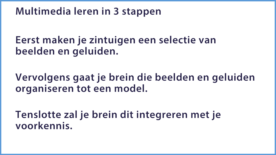
Use a communicative style of writing (including the use of the I and you-form) and a friendly, human one.
You can personalize the text by writing it from the perspective of the person himself. After all, we describe a process here that takes place in every mind and thus in that of the student as well. Speaking about ‘your senses’ and ‘your brain’ feels less detached than ‘senses’ and ‘brain’. You can aslo write the second sentence in an active form (try to avoid using the verb ‘be’).

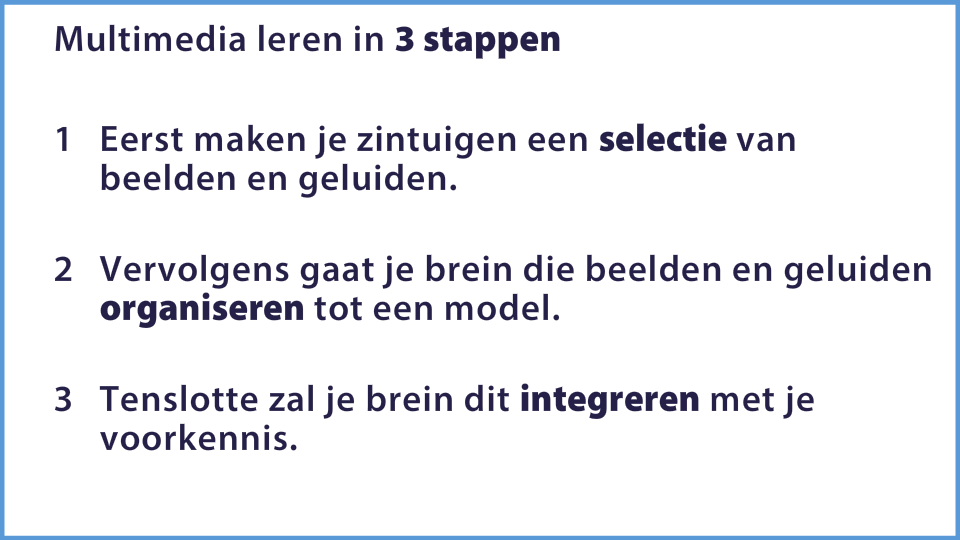
Focus the attention on critical and essential aspects of the learning material by means of extra markings.
We can improve this text by creating a numbered list and put the key words in bold text.
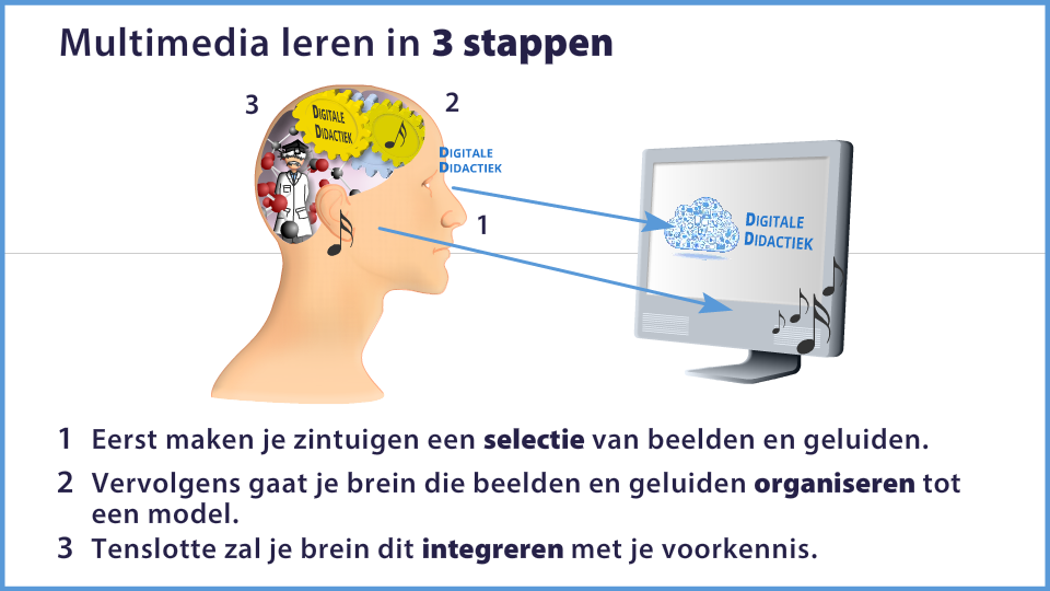
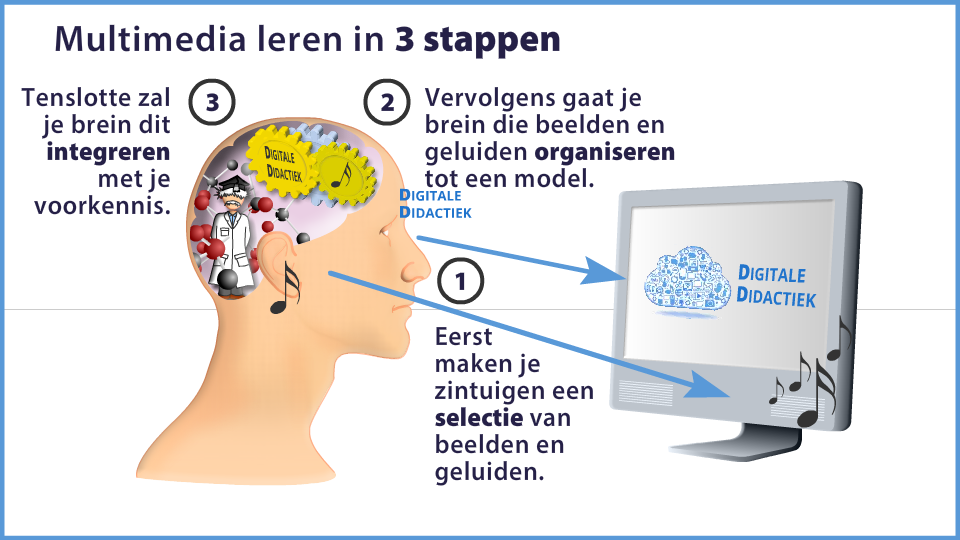
Text combined with image is better than text alone.

We make this text clearer, for example by means of, an image.
The space between the corresponding words and images should be minimal.

We put the text in the image but not below.
An image in combination with audio is better than written text. The latter will overload the visual channel.

We provide the text audible and in the image, we only put keywords.
Corresponding words and images must appear simultaneously.
Here we have animated the drawing, synchronous with the audio.
Image plus audio is better than picture plus audio plus text. The latter leads to “cognitive overload’.
Subtitles in the same language as the audio are distractive. This can be a tool only for non-natives or people with a low literacy.
Avoid unnecessary, unrelated words, images and sounds.
In this example, background music is used. It is better that you avoid that..
Show only the essential images.
It has no value to bring the teacher into view, in addition to the visual animation. Her voice is sufficient.
Design effects have a stronger effect on participants with little prior knowledge and on participants with a poor spatial awareness.


